In the world of custom apparel, DTF (Direct-to-Film) printing has quickly become a top choice for creating vibrant, durable designs. But before you can get that perfect print, there’s one crucial step: file preparation. A great DTF printer can’t fix a bad file. If your artwork isn’t set up correctly, you risk blurry images, wrong colors, and lost details.
This guide will walk you through the essential steps of preparing your files so your DTF prints are crisp, vibrant, and exactly what you envisioned. We’ll cover everything a beginner needs to know, including CMYK+W, 300 DPI resolution, and more, to ensure a flawless result every time.
Understanding CMYK+W for DTF Printing
In traditional printing, most images are prepared using the CMY color model: cyan, magenta, yellow, and black. But DTF printing introduces a unique and crucial addition: the “+W” or white ink channel.
- CMYK: This is the standard full-color process. The four inks are mixed to reproduce all the colors in your design.
- White (W): This is more than just a color; it’s the foundation for your print. White ink is printed as a base layer first, ensuring your colors appear bright and vibrant on dark or colored fabrics. Without this white layer, your colors would look dull or even disappear on a black shirt.
It is essential always to separate your white layer in your design file. This extra channel is required by most DTF printers, and it ensures that the colors in your artwork have a solid, opaque base, resulting in a clean and professional-looking print.
Why 300 DPI is Important?
DPI, or dots per inch, measures the level of detail within an image. In simple terms, it tells you how much information is packed into every single inch of your design. The higher the DPI, the sharper and more precise your final print will be.
For DTF printing, 300 DPI is the essential standard. If you use a lower resolution, your prints will suffer in quality. A design with a lower DPI might look fine on a bright computer screen, but once it goes to the printer, every flaw will be exposed. This often results in a final print that looks blurry, pixelated, or lacks clear definition.
For instance, if you have a 10×10-inch design that was saved at 150 DPI, it may appear crisp on your screen. However, our printers don’t have enough data to reproduce it clearly, which will lead to a soft, unprofessional-looking image.
To guarantee your artwork is reproduced perfectly, it is crucial to start with a file that is 300 DPI at the final print size. This simple step ensures consistent, high-quality results every time.
What Are Knockouts In DTF Printing?
In DTF printing, a knockout is an area where the white underlay is intentionally removed so the colored inks print directly onto the film without interference.
This is a critical step for two main reasons. First, it prevents your colors from becoming “muddy” or distorted. Without a knockout, the white ink might unintentionally show through or mix with your colors, ruining the clarity of your design. Second, knockouts are essential for creating true transparency.
For instance, if you have a logo with cut-out areas, knocking out the white ensures those areas remain empty, so the final transfer blends perfectly with the garment.
In design programs like Photoshop or Illustrator, you’ll need to create a separate white layer beneath your CMYK layer. Then, use tools like clipping masks or layer settings to define exactly where the white ink should and shouldn’t appear.
Always preview your knockout layer by itself to confirm it perfectly matches the final look you’re going for. This simple technique is key to achieving a clean, professional, and accurate final print.
What are ICC Profiles?
If you’ve ever printed something only to find the colors look completely different than on your screen, an ICC profile is likely the missing piece.
An ICC (International Color Consortium) profile works to standardize colors across different devices. Think of it as a translator that ensures the colors you see on your monitor are accurately reproduced by your printer. For DTF printing, using the correct profile is crucial for getting the colors you expect. This is the correct way of using them:
- Source the right profile: Always use the ICC profile provided by your specific printer manufacturer or film supplier.
- Match your settings: Ensure your design software (like Photoshop or Illustrator) is set to the same color space as your ICC profile.
- Convert your files: Before you export your final file, convert it to this correct profile.
Without using the right ICC profile, even a perfectly prepared CMYK+W file can result in dull or inaccurate colors. By using the correct profile, you can be confident that the colors on your screen will closely match the vibrant colors on your finished garment.
Step-by-Step Guide For Beginner Workflow:
For batch printing, it’s a good practice to organize your files into clearly labeled folders to prevent any mix-ups and speed up your workflow. This is a step-by-step guide on how you should proceed while preparing your files.
- Design Creation: Start by creating your artwork in your go-to software, whether it’s Photoshop, Illustrator, or CorelDRAW.
- Set Your Color Mode: Make sure your main design is set to CMYK. Then, create a separate layer dedicated specifically to your white (W) ink.
- Check Your Resolution: Always work with a resolution of 300 DPI to guarantee your design will be sharp and clear when printed.
- Apply Your Knockouts: Use this technique to remove the white layer from any areas that you don’t want to have a white base. This ensures your colors stay true and prevents unwanted white from showing through.
- Convert with ICC Profile: Convert your final file to the ICC profile that is specific to your printer. This crucial step ensures that the colors you see on your screen are accurately reproduced in the final print.
- Export Your File: Save your finished file as a PNG or TIFF with a transparent background.
Common Mistakes to Avoid:
Knowing what to avoid is just as important as knowing what to do. Our team has seen many designs that could have been great if a few simple mistakes had been avoided. Here are the most common issues that can lead to unsatisfying results:
- Low-Quality Files: DTF is known for its ability to produce sharp, crisp lines. However, if your design file has a low resolution (under 300 DPI), the final print will appear blurry, pixelated, or have uneven edges. A clean print starts with a high-quality file.
- Designs with Tiny Details: Designs featuring very small dots, thin lines, or extremely fine details can be problematic. The thin layer of adhesive covering these delicate parts may be too fragile to withstand wear and washing, causing the print to peel or crack over time.
- Large, Solid Prints: While DTF is great for big designs, covering a huge area with a single solid print can result in a final garment that feels stiff and less breathable. This can compromise the comfort and feel of the apparel, especially in hot weather.
- Black on Black: We advise against placing a black design on a black fabric. The white underbase required for DTF to make colors pop can cause the black ink to look faded, dull, or slightly gray on a black garment. For the best contrast, use a lighter color.
- Gradients to Transparency: Creating a gradient that fades to transparency is challenging with DTF. This effect is achieved with tiny dots, which are prone to peeling over time. For a reliable, long-lasting print, we recommend avoiding gradients that fade completely to nothing.
What’s The Difference Between RGB And CMYK
| Feature | RGB (For Screens) | CMYK (For Print) |
| Use Case | Digital displays (monitors, phones). | DTF and all other printers. |
| Color Model | Adds light to create colors. | Mixes ink to create colors. |
| Best Practice | Great for designing; colors are vibrant on screen. | What you see is a closer match to your final print. |
| Key Point | It will be converted by the printer, which can cause colors to look duller or “off.” | Gives you full control over your colors before you print. |
Some Common Mistakes People Make:
Even simple mistakes can ruin a great design. To avoid these issues, always double-check layers, resolution, and color profiles before submitting files. A little preparation goes a long way. Here are the most common errors our team sees and that people usually make:
- Forgetting the White Layer: A common mistake is to skip adding a white base layer. Without it, colors will look faded, dull, or even invisible on dark or colored fabrics.
- Using a Low-Resolution Image: People often use a file that looks good on screen but is too low in quality for printing. This leads to a final print that is blurry, pixelated, and unprofessional.
- Incorrect Knockouts: A frequent mistake is failing to properly “knock out” the white base. This can result in unwanted white ink showing through the design, especially in transparent areas.
- Skipping the ICC Profile: Many designers forget to use the correct color profile. This causes the colors on the final print to look different from what they saw on their screen.
- Designing in RGB: This is one of the biggest mistakes. DTF printers use CMYK, not RGB. When an RGB file is sent, the printer is forced to guess, which can cause significant color shifts and lead to an unsatisfying print.
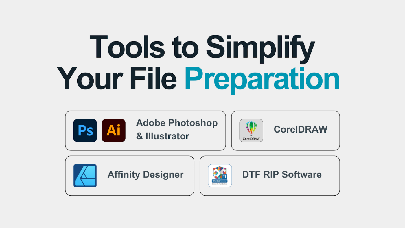
Tools to Simplify Your File Preparation
While understanding the manual process is essential, the right software can make DTF file preparation much easier. Here are some of the most popular tools that simplify the workflow for beginners and professionals alike:
- Adobe Photoshop & Illustrator: These are the industry standard for a reason. With powerful layering tools, advanced color management, and robust features for creating knockouts, they give you complete control over every detail of your design.
- CorelDRAW: A strong and popular alternative, especially for creating vector-based artwork. It provides all the necessary functions for managing CMYK and white layers, making it a great choice for logos and graphics.
- Affinity Designer: This is a powerful and more budget-friendly option. It offers many of the same features as the industry giants, allowing you to handle vector and raster designs with precision without a subscription.
- DTF RIP Software: Many DTF printers come with their own Raster Image Processor (RIP) software. This specialized program automates much of the file prep, such as generating the white layer and managing color profiles. It can save you significant time and effort.
How to Prepare Files for Different Garment Colors
One of the best things about DTF printing is that you aren’t limited to just white shirts. But to get the best results, you need to adjust your file prep based on the color of your fabric.
Light Fabrics:
When you’re printing on white or light-colored shirts, the fabric itself acts as the perfect bright canvas for your design. Because the colors have a light base to sit on, you can often skip the white underlay (the “+W” layer). This can sometimes make the final print feel a little lighter and more breathable.
Dark Fabrics:
This is where the white underlay is essential. If you print a CMYK design without a white base on a black or dark-colored garment, the colors will look dull, faded, or almost completely washed out. The white ink is what makes your colors pop and gives them the vibrant, opaque look you want.
Colored Fabrics:
When you’re printing on a colored garment (like a red shirt or a blue hoodie), you’ll need to be mindful of how your design colors might interact with the base color of the fabric. The final print’s appearance can be slightly influenced by the garment’s color, so you might need to make small adjustments to your CMYK tones to get the perfect match.
No matter what color fabric you’re using, it’s always a good idea to do a small test print first. This quick step can save you from a huge production mistake, especially when you’re working with a new design or material.
Exporting Your Files Correctly
After all that hard work, the final step is to export your design in the right format. Don’t mess it up now!
- PNG: This is the most popular choice for DTF. It’s a simple, reliable format that keeps your background transparent, which is exactly what you need.
- TIFF: Think of this as the professional’s choice. TIFF files can handle layers and high-resolution data better than a PNG, making them great for complex, detailed artwork.
- Separate White Layer: Some printers or RIP software require you to export your white layer as its file. Always check your specific printer’s guidelines to be sure.
No matter which format you choose, your export must preserve the 300 DPI resolution and the ICC profile settings you’ve worked so hard on. Be careful not to over-compress your file; this can ruin your print quality.
Why Choose American HTV As the Best Option For You?
At American HTV, we’ve taken the guesswork out of DTF printing. We specialize in films and solutions designed to make your life easier. Our products are made to work flawlessly with your CMYK+W workflow and those all-important 300 DPI files.
We’ve got you covered with the right ICC profiles for perfect color and simple guidance on knockouts. This means even if you’re just starting, you can produce professional-grade prints from day one.
Whether you’re creating a few custom shirts or launching a new apparel brand, following these file preparation steps will help you get the best results every time. And with American HTV, you’ll have the right tools to make it happen.
Frequently Asked Questions (FAQs)
Why is file preparation so important?
A perfect print starts with a perfect file. Good file prep ensures your colors are vibrant and your design is sharp, avoiding blurry or dull results.
Is 300 DPI a must?
Yes. It’s the standard for print quality. Anything lower will lead to a pixelated or blurry design.
What’s the deal with ICC profiles?
An ICC profile is a color guide that ensures the colors on your screen match the final printed colors, avoiding disappointment.
What is the Best way to save my file?
Save as a PNG or TIFF with a transparent background. These formats keep your resolution and transparency settings intact.